oil paintings

Would the real Frida please stand up!
If you were reading about Frida in the 3D section, you will already know she also occurs in the 3D artworks as well. However, she originates as a character in the oil painted series. Named, in part, on account of Frida Kahlo, one of the most important artists of the 20th century but also because the name means ‘beloved’ and ‘beautiful’.
The real story of her introduction into this series is however a little deeper. The Mexican artist, Frida Kahlo, was badly injured in a bus accident but managed to transform her pain and suffering into inspiration, art and creativity. Keith’s art began with seeking to re-imagine Belfast, a city also scarred by suffering and division. His aim was to create artworks that would celebrate the city, its places and its people. This theme is now carried over into the hand-painted oil series. Frida can be found in this series as a postmodern woman of strength, character and attitude, always ready to write and graffiti any object that comes to hand, but she is always found enjoying and engaging with the cities she explores. Stylistically however, you may notice there is no connection between Frida Kahlo and Keith’s artistic style!

IT’S MESSY BUT GOOD
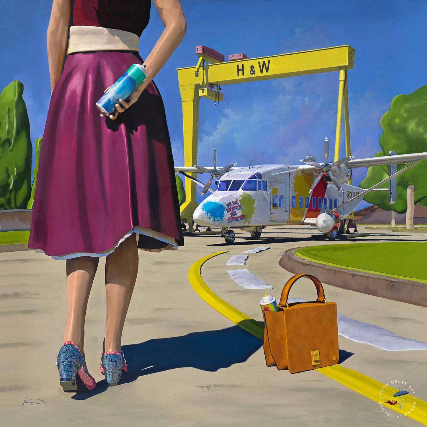
Whilst Keith has become known for his vivid 3D cityscape artworks, he has always been an oil painter ever since he was young. This new series marks a return to oil painting. He says it’s nice getting his hands messy again, but in reality, Keith enjoys the blend of creating art in both mediums. His challenge was deciding on a subject to paint now that he has become well known as an artist. He says this series has been at least five years in the making, the time being spent on planning, thinking about styles and experimentation. He wasn’t prepared to release a new series until he had met a number of standards he had set for himself. These were: the art had to be contemporary in style; they had to be strong on narrative; and they had to link to the 3D art he was known for. In the artwork, ‘Sail away’, Keith has produced a hand painted artwork that in many ways feels 3D and imitates his own buildings from his 3D series in terms of style. Another requirement Keith set was that the oil paintings had to introduce something new to the art scene rather than just be a copy of another artist. Whilst there is nothing truly new that hasn’t been done in some manner before, we think this series introduces something stylistically innovative to the art world. The originals are quite large, painted on 30x30 inch canvas, and for those who are interested, Keith likes using mediums of oleopasto, beeswax and alkyd resins mixed with his oil paints - oh, and also very fine razor brushes!

THEMES TO CELEBRATE
This new oil painted series, much like the existing 3D series, celebrates the places where people live and work. Each piece endeavours to communicate a positive and celebratory message which is uplifting. The artworks also try to capture what Keith has coined ‘retromagic’ as the artworks seek to present an escape into a retro but magical world which is still instantly recognisable. The protagonists communicate with their environments and, if you look very carefully, you will see some overlap in the paintings. Have you noticed that the aerosol used to graffiti the Shorts SD3-30 aircraft in ‘A Good Day’s Work’ also appears in the artwork ‘The Washroom Window’?
As for the shoes, which are often painted in delicate detail, these form part of the juxtaposition of the characters in their activities. For example, who wears shoes like the girl in ‘Sail Away’ to float paper boats by herself? Keith has always liked the element of surprise, therefore this narrative communicates that the subject is confident in her own space to do just what she wants. This core message forms part of the theme of the series celebrating being free and becoming emboldened to do as we wish, even if others would call it a little ‘childlike’ in manner. Keith’s message is that sometimes we need to escape the busyness of life and re-engage in a lost, childlike celebration of life, indulging in the little things that make us smile and transport us back to days when we were younger when life was always set under a summer sky.
Another stylistic approach Keith is employing, is that things which are not treated as significant to the artwork, (or to the characters featured in them), are painted in a minimalist style, almost vector-like. These are the things that may be very much part of life, but are not the main focus of the artwork. For example, trees and hedges often have very little detail and serve to only form the background environment whereas the aerosol, or a shoe buckle, may be painted with much more realism. Keith refers to this as ‘character focus transference,’ helping the viewer to see life through the eyes of the central character.